accessX: an open-source Python library for accessibility analysis: This modular toolkit can build networks, model travel costs, and compute reachable opportunities from open spatial data (OSM-first, extensible, reproducible).
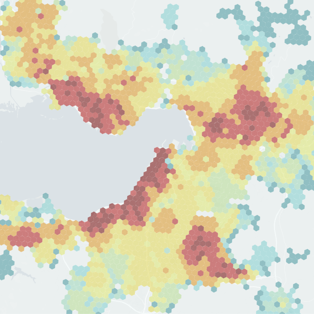
15 Minute City Score Europe Map: This interactive map visualizes accessibility scores across European Functional Urban Areas (FUAs) using consistent spatial analysis methods. The analysis is built upon the 15 Minute City Score Toolkit.
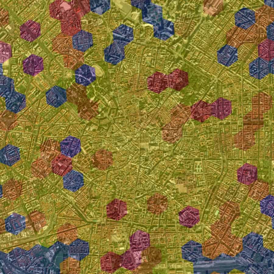
PAC İzmir: 15-Minute City Score: The interactive map visualizes walkability across İzmir’s bay area through three views, i.e. 15-Minute City Score, Points of Interest, and Population. Users can explore the map at many spatial levels, like the H3 hexagonal grid, neighborhoods, and districts.
F.AIR Fragile AIR Unfair Health WebGIS: This dashboard presents the results of the F.AIR project, including GIS-based analyses of urban air quality, demographics, built environment factors, and service accessibility, along with statistical analysis of pollutant concentration measurements.
Seeing the Heat WebGIS: This interactive map explores how urban form influences outdoor thermal comfort in Milan. You can visualize hourly Physiological Equivalent Temperature (PET), examine street-level shadow patterns, and compare composite urban indicators derived from image-based features.

Tracce: the Web App in support of Monza’s PEBA – Plan for Eliminating Architectural Barriers: Tracce.app helps people in Monza find accessible routes providing an accessibility-oriented alternative and enables participatory reporting for georeferenced barriers and data improvement.
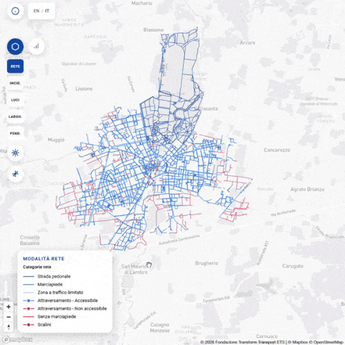
Tracce WebGIS Map: this interactive WebGIS presents data from the Tracce project in support of Monza’s Plan for Eliminating Architectural Barriers. The integrated data help identifying accessible and inaccessible segments, physical barriers, and areas requiring intervention, providing a holistic view of urban accessibility challenges and opportunities of the City of Monza.
![]()
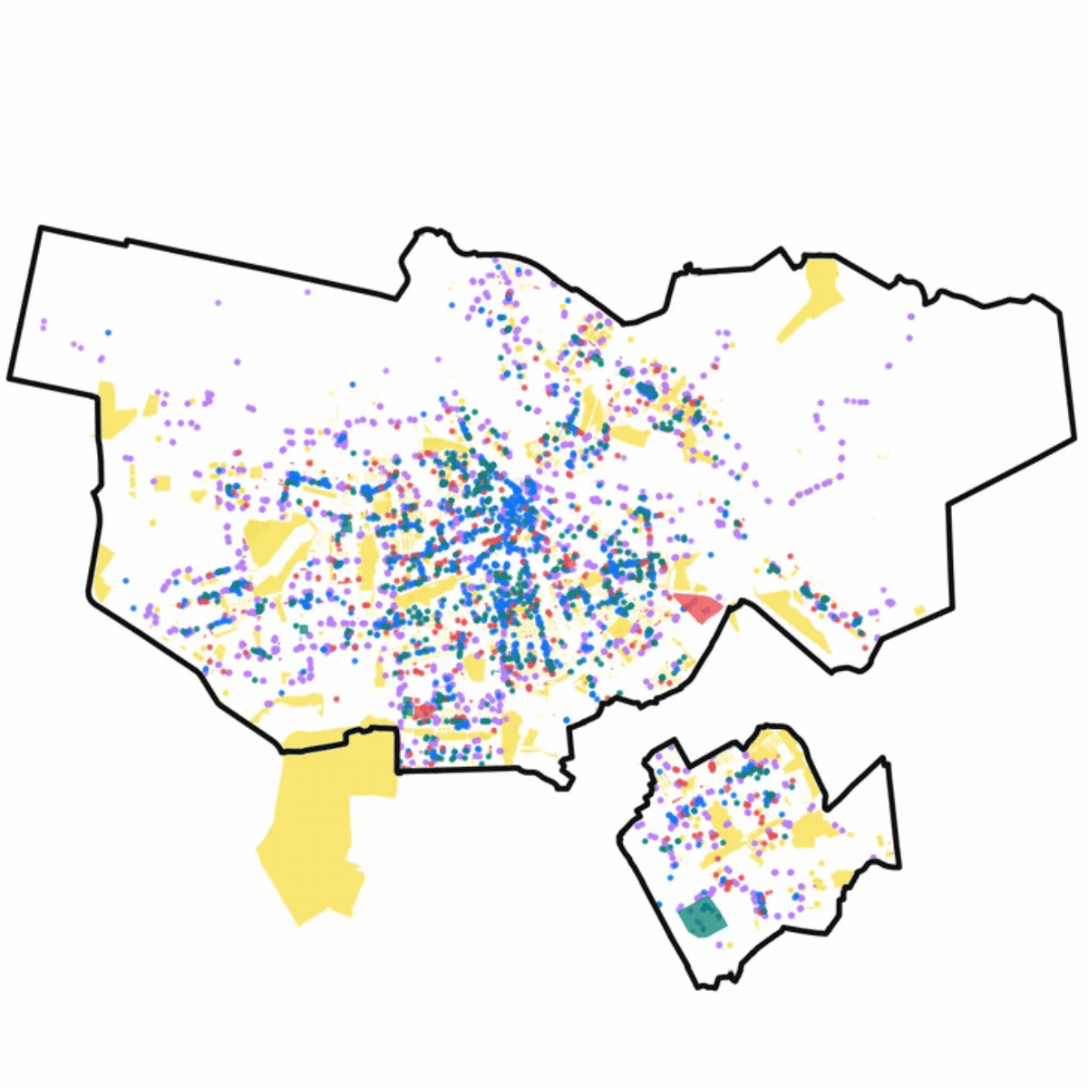
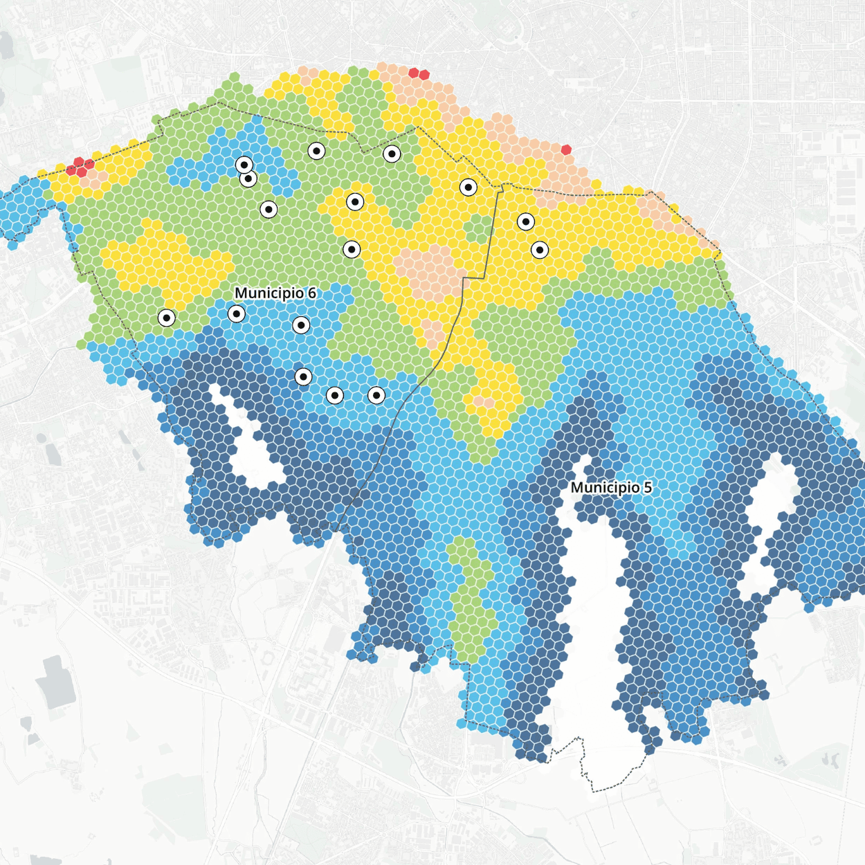
Sustainable Urban Mobility Metrics in the Metropolitan City of Rome: The map highlights three key metrics for analyzing sustainable mobility in the Metropolitan City of Rome: (i) the 15m CS – 15-Minute Score City; (ii) the LTS – Bicycle Level of Traffic Stress; and (iii) the PTOL – Public Transport Opportunity Level.
![]()
15min City Score Toolkit – QGIS Script: A toolkit integrated in the QGIS environment to estimate the 15min City Score, an urban metric that gives a comprehensive overview of a city’s walkability based on the availability of essential services. Licensed under CC BY-NC-SA 4.0.
![]()
Spatial Analysis of Citizens’ Travel Data: The Pollicino Project – The Case of Cagliari: This research investigates citizens’ travel data in Cagliari using the GPS traces collected through the Pollicino project (in collaboration with Fondazione per lo Sviluppo Sostenibile).
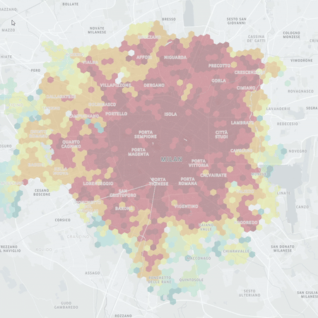
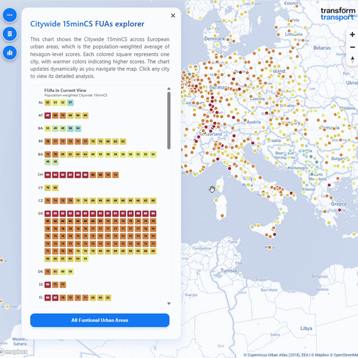
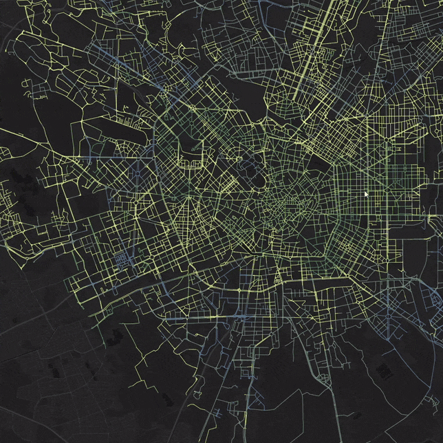
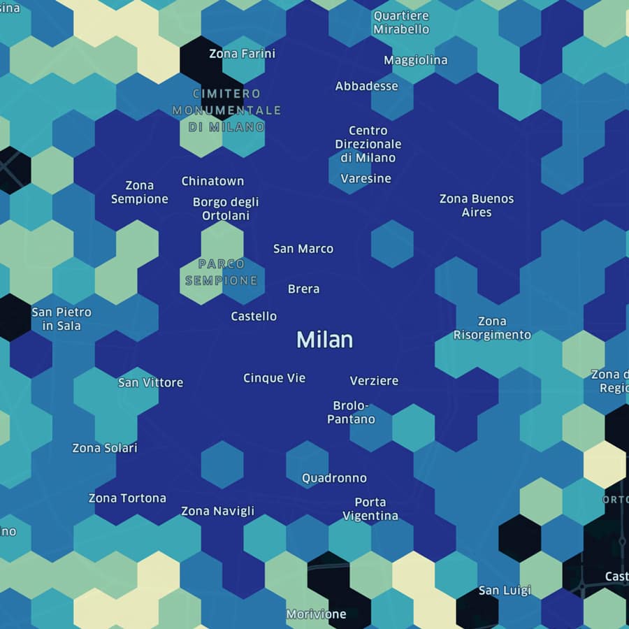
15min City Score Gallery: The map shows the results on over 112 cities of the Python tool developed to automate the evaluation of service accessibility.
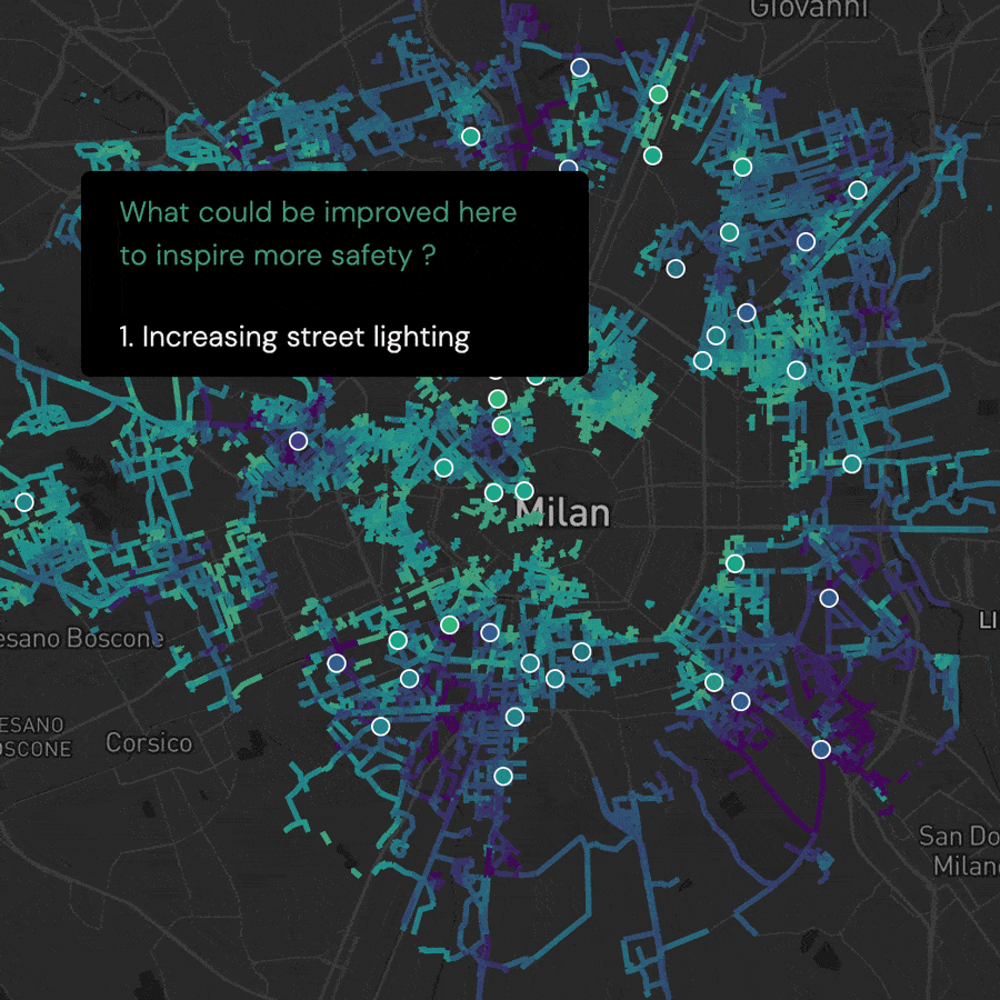
STEP UP – data storytelling: Designed by Modality, this webgis platform provides an interactive mode to investigate data results of the STEP UP research project focusing on the spatial diversity of the factors that influence women’s perception of safety.
STEP UP – Safety Index Map: The map shows the perceived safety during the night estimated through a Geographically Weighted Regression Model. Explore the map interactively by scores and districts.
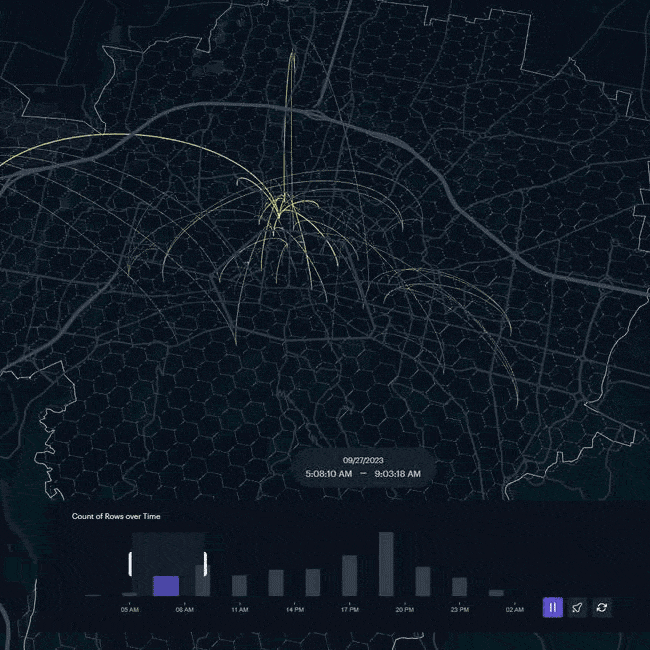
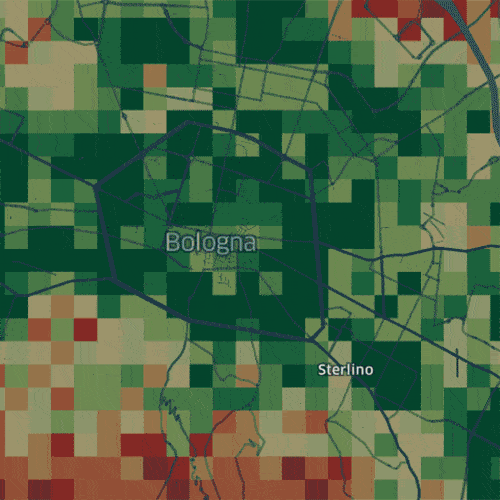
Spatial Analysis of Citizens’ Travel Data: The Pollicino Project – The Case of Bologna: The research investigates citizens’ travel data in Bologna using GPS traces collected through the Pollicino project (in collaboration with Fondazione per lo Sviluppo Sostenibile).
Nature-based Solutions to Mitigate Vehicular Traffic Pollution Beyond SUMPs: The map shows the average performance of each tree species to absorb the rate of fine particles emitted by vehicles and the annual emissions of all diesel-powered cars as well as the future green infrastructures defined in the PGT of Milan (2020).
Walkability for Children in Bologna: The map shows the neighborhoods of the city of Bologna characterized by the lowest level of pedestrian friendliness in relation to the children’s needs while walking. Results helped to identify and characterize a short list of suitable areas where to prioritize interventions.
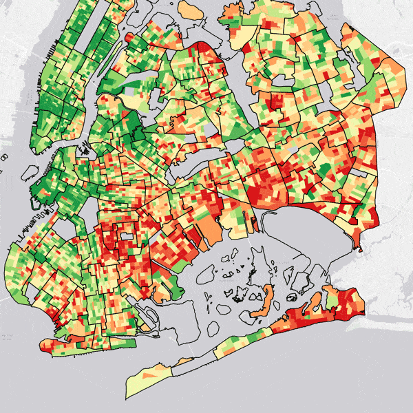
Walkability for Women in New York City: The map examined the level of walkability for women in NYC. The results of the proposed Walkability for Women Index have been compared to the National Walkability Index, in order to highlight the impact of individual characteristics of pedestrians on the perceived level of walkability.
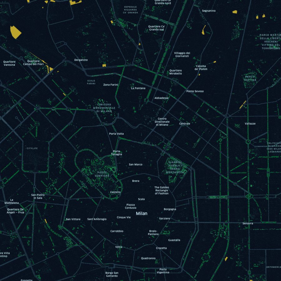
Unlocking Hidden City Metrics: The map indicates the Suitability Analysis Index for the City of Milan, highlighting potentials for relevant pedestrian flows, based on the analysis of proprietary data on pedestrian counts collected in Milan from the beginning of November 2020 to the end of July 2021 through a network of sensors.
Mobile Devices and POIs: The map shows the density distribution of POIs in Milan and the percentage difference related to the average number of mobile devices detected inside the catchment areas of the Wi-Fi Access Points during the Pre-Covid-19 period and during the Phases 0-3.

Milan Sidewalks Map: This map shows sidewalks widths in Milan and highlights the critical areas where physical distancing cannot be respected. The preliminary results is that more than 40% of Milan’ sidewalks is not adequate to allow the necessary social distancing measures.

Evolution of the Lockdown Phases in Milan: The map shows the aggregate traffic data collected through a network of Wi-Fi sensors from the beginning of January 2020 to the end of July 2020, highlighting the impact of the lockdown phases on urban mobility in Milan.