15 Minutes City Score Europe Map
Explore the data through our interactive map
The 15 Minute City Score (15minCS) is an urban metric that quantifies walkability by measuring accessibility to essential services within a 15-minute walking distance. The 15 Minute City Score Europe Map is an interactive tool that visualizes accessibility scores across European Functional Urban Areas (FUAs) using consistent spatial analysis methods.
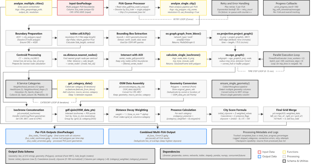
The analysis is built upon the 15minCS Toolkit and employs H3 hexagonal grid system (level 9) for spatial consistency, calculates isochrones using OSM pedestrian networks, and identifies service accessibility using eight essential service categories extracted from OpenStreetMap amenity data. The analysis integrates Copernicus Urban Atlas (2018) data for urban areas identification and population distribution.
This process led to an interactive map and the underlying open source dataset. Explore the map to compare accessibility across cities, select any urban area to examine detailed accessibility patterns and service distribution in relation the resident population.
Introduction
Walkability is a fundamental quality of urban life that shapes how we experience and interact with our cities. At its core, it describes how an environment supports walking as a means of moving through neighborhoods, accessing services, and engaging with the urban fabric (Speck, 2013). A walkable city is not merely one where walking is possible, but one where it is practical and represents a viable choice for daily life. The importance of walkability extends beyond transportation planning, influencing property values, public health outcomes, social interaction, and environmental sustainability. Recognition of these impacts has led to the development of various assessment tools, with Walk Score® (Redfin, N.D.) being well recognized in different fields spanning from real estate to public health (Hall & Ram, 2018). Central to the concept of walkability is the principle of proximity: the idea that essential services and amenities should be within reasonable reach of where people live. This principle is grounded in the overarching framework of general accessibility (Geurs & van Wee, 2004; Hansen, 1959), which recognizes that physical proximity directly impacts citizens’ quality of life and their ability to meet daily needs without dependence on motorized transportation. When services are nearby, cities become more livable, equitable, and sustainable. This emphasis on proximity found renewed expression in the 15-minute city concept, which became particularly popular in the post COVID-19 pandemic world (Moreno et al., 2021). While this concept has now been expanded to general proximity (Martinuzzi, 2025), its communicative efficacy remains relevant: residents should be able to access most of their daily needs within a short walk or bike ride from their homes. While the idea gained global attention recently, it builds on earlier initiatives such as Portland’s 20-minute neighborhood strategy implemented in 2010 (City of Portland, 2012), which established goals for accessing grocery stores, commercial services, parks, schools, and transit stops within a defined walking distance. The common approach between these applications is the definition of a specific timeframe, whether 15 minutes, 20 minutes, or n minutes, and the overarching concept is the sustainable and equitable opportunity to access essential facilities for all urban residents. Translating these ideas into practice requires quantitative analysis. Research efforts have increasingly focused on assessing the compatibility of existing cities and urban areas with the 15-minute city concept by evaluating analytically how service accessibility is distributed across different neighborhoods. However, measuring accessibility raises important questions about equity: should we aim to equalize accessibility levels across all neighborhoods and population groups, or should we focus on ensuring everyone reaches a minimum acceptable threshold? These two approaches reflect different ethical perspectives on fairness in urban planning and are still an open research question. Our framework is based on the sufficientarian approach, exploring everyone’s access to a minimum threshold level of essential services: a sufficient level below which people may become socially excluded (Lucas et al., 2015).Time and City
Chrono-centric planning approaches
Understanding urban accessibility requires moving beyond static, distance-based representations of cities to embrace what Fabio Casiroli called a “pliable” approach to urban analysis: one that recognizes how the experience of a city fundamentally changes depending on the time of day and the mode of transport used (Casiroli, 2008). His seminal work Khrónopolis. Accessible City, Feasible City shaped the transportation planning field by shifting attention toward a time-centric conceptualization of the urban environment, demonstrating that cities are not fixed entities but dynamic systems whose functional geography shifts with the rhythms of daily life. A neighborhood that appears well-connected at 9AM when public transport runs frequently may become isolated at 10PM when services diminish. The same distance that takes 10 minutes to walk might require 30 minutes by car during rush hour or become inaccessible entirely after dark due to safety concerns. This temporal dimension is critical to the 15-minute city concept, with time, rather than distance, emerging as the more appropriate variable for assessing urban functionality. In Khrónopolis it was suggested that 45 minutes in each direction, or a total of 1.5 hours, represents a reasonable time frame for most urban commuters to access primary urban functions from their point of departure (Casiroli, 2008), in the current approach the 15-minute walking threshold represents a more ambitious yet achievable target for daily essential services, setting a benchmark for evaluating the quality of time spent on connectivity.The need for a Tool
Iterations toward the 15minCS Europe Map
The practical application of the 15-minute city concept requires rigorous quantitative analysis to move beyond aspirational visions and toward evidence-based planning decisions. The development of accessibility assessment methods has followed an iterative path, with each phase revealing new insights while also exposing the limitations of manual, time-intensive analytical processes.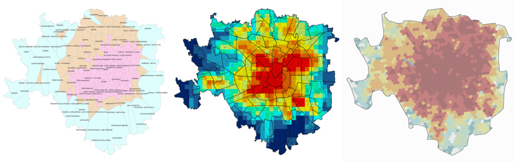
Mapping Milan micro-centers
Read the full article
Initial efforts to operationalize the 15-minute city framework for Milan in 2020 focused on supply-side analysis of service distribution (Abdelfattah et al., 2020). Using a Voronoi tessellation method, the analysis identified local micro-centers characterized by diversity, compresence, and proximity of essential services. The results revealed that while more than half of Milan’s surface area was characterized by low-proximity local centers requiring more than 15 minutes to access comprehensive services, only 27% of the population resided in these underserved areas. Central districts such as Porta Garibaldi-Porta Nuova, Porta Venezia, and Brera emerged as exemplary neighborhoods achieving high service diversity and density, with an average pedestrian-friendly micro-center containing approximately 330 shops, 170 bars and restaurants, and 90 supermarkets. However, this supply-focused approach, while valuable for identifying service gaps, did not fully capture the dynamic relationship between population distribution and service accessibility.Milan 15-minute City Model
Read the full article
This recognition led to the development of a more sophisticated demand-driven methodology in 2022. The evolved approach employed a multi-layered analysis that combined demand-side population mapping with supply-side service distribution and compound walkability metrics. The concept of cumulative population, represents not only residents living in each cell but also those able to reach it within specified timeframes, the analysis provided a more nuanced understanding of accessibility patterns across both residential and workplace populations. The study revealed critical mismatches between population distribution and service provision, showing that neighborhoods such as De Angeli, Lotto, and Porta Genova, despite high residential populations within 15-minute walking range, lacked adequate coverage by all primary service groups (Abdelfattah et al., 2022). These challenges became particularly acute as the 15-minute city concept gained traction in the post-pandemic period. Major cities began incorporating proximity-based planning into their urban strategies, and the European Union’s Mission for 100 Climate-neutral and Smart Cities by 2030 created an urgent need for scalable, replicable methods to evaluate service accessibility across diverse urban contexts. The gap between the sophistication of available analytical frameworks and the practical capacity of most cities to implement them highlighted the necessity for an automated, open-source solution.15min City Score Toolkit
Read the full article
In response, the 15min City Score Toolkit was developed as an end-to-end solution that streamlines the analytical process while maintaining methodological rigor (Albashir et al., 2024). The tool uses OpenStreetMap as a worldwide available open data source, adopts Uber’s Hexagonal Hierarchical Spatial Index (Uber, 2018) for consistent spatial discretization, and implements standardized algorithms for isochrone generation and accessibility computation. Packaged both as a standalone Python notebook and as a QGIS plugin, it has been tested on over 112 European cities, demonstrating its effectiveness across urban contexts of different sizes, geographical locations, and data availability conditions. Initial visualization efforts through the 15min City Score Gallery provided a first comparative view of service accessibility across European cities (Transform Transport, N.D.). However, a critical limitation emerged in the reliance on administrative city boundaries, which often fail to capture the functional reality of how urban regions actually operate. This recognition has driven the development of an expanded analytical and visualization framework that addresses the territorial dimension of urban accessibility, moving beyond arbitrary administrative limits to better represent the lived experience of metropolitan areas.The Making of the Map
Building blocks and definition
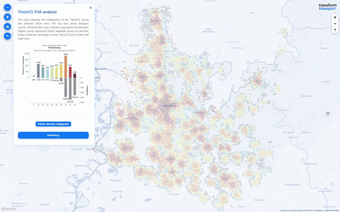
The 15 Minute City Score Europe Map covers 786 Functional Urban Areas (FUAs) with more than 50,000 inhabitants across EEA38 countries and the UK, identified using boundaries from the Copernicus Land Monitoring Service Urban Atlas 2018 (Copernicus Land Monitoring Service, 2020). The choice of commuting-derived FUA boundaries, rather than traditional administrative limits, allows for the analysis of continuous metropolitan territories with a consistent approach across countries. Within each FUA, H3 hexagons at resolution 9 (~174m edge length, ~0.105 km² area) were generated to cover all residential land use classes from the Urban Atlas, inclusive of a 1km buffer from each land plot. The hexagonal tessellation provides a standardized spatial unit for analysis, with each hexagon representing a distinct neighborhood area. The 15minCS was then computed for each hexagon using a modified version of the 15min City Score Toolkit, drawing on OpenStreetMap data (Geofabrik extract, 30 April 2025) for both the pedestrian network and the eight categories of essential services.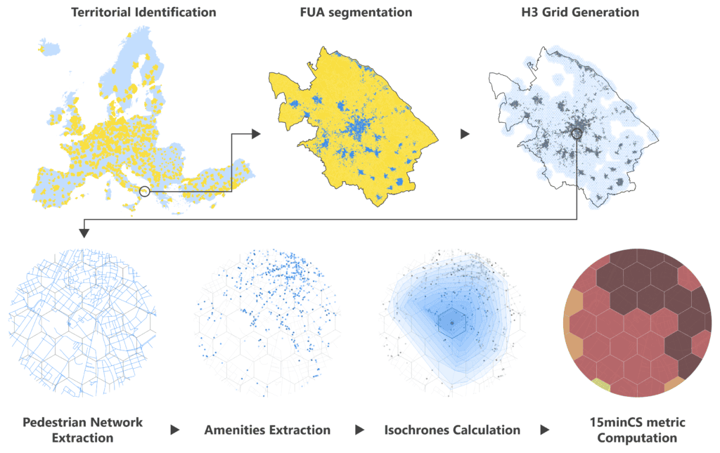
The Map
The 15 Minute City Score (15minCS) is an urban metric that quantifies walkability by measuring accessibility to essential services within a 15-minute walking distance. The interactive 15minCS Europe Map visualizes accessibility scores across European Functional Urban Areas (FUA) using consistent spatial analysis methods. Explore the overview map to compare accessibility across cities, then select any urban area to examine detailed accessibility patterns and service distribution in relation the resident population. The interactive web application visualizes the results across three complementary exploration layers, designed to support analysis at different spatial scales.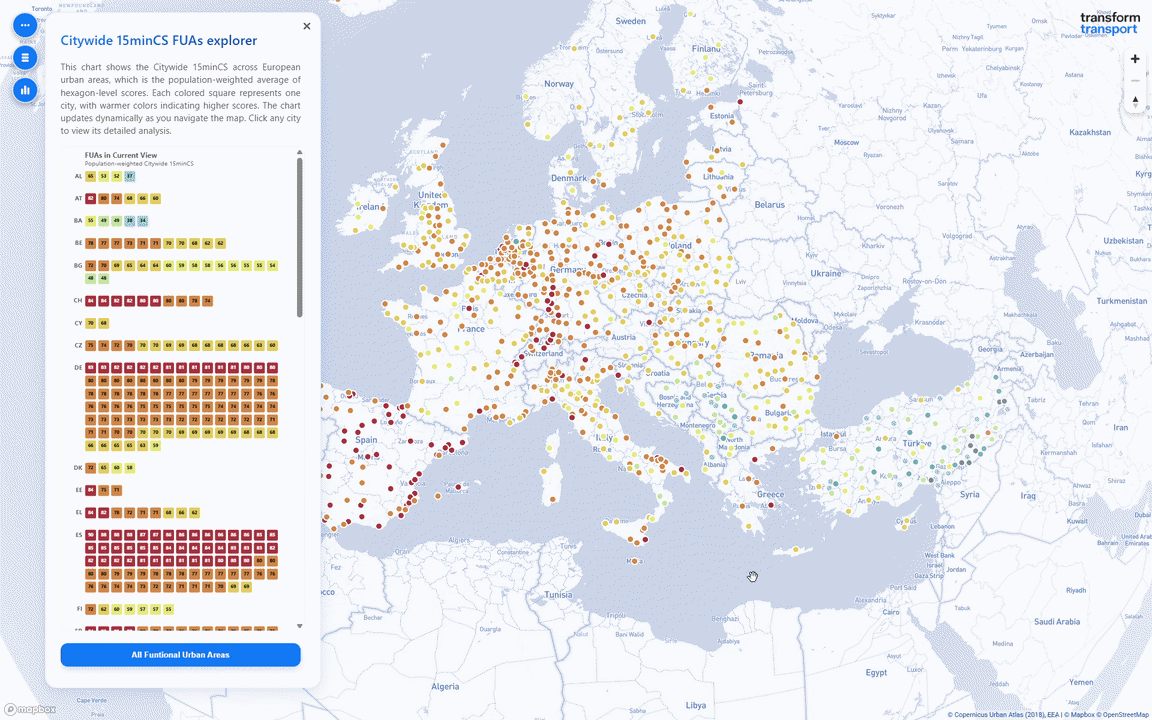 Figure 4 Citywide 15minCS FUAs explorer: Europe-wide overview with the interactive FUA ranking chart.
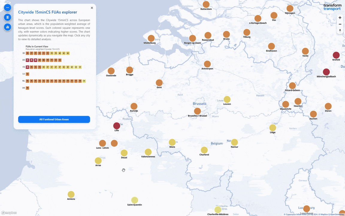
PUBLISHED OPEN DATA
The dataset behind this map is available on Transform Transport’s repository on Zenodo following the FAIR principles. We invite citizens, researchers, planners, and city makers to explore, critique, and build on it.
Messa, F., Presicce, D., Pedrazzoli, A., Albashir, A., & Gorrini, A. (2026). 15min City Score – Europe Map [Dataset]. In Transform Transport Open Data Collection. Zenodo. https://doi.org/10.5281/zenodo.19610329